From Legacy App to Strategic Digital Channel

Putting Peace of Mind Back in 1M+ Members’ Pockets
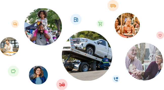
For over a century, the Alberta Motor Association (AMA) has been dedicated to delivering roadside assistance to its members. Throughout its evolutionary journey, the organization has broadened its scope to encompass various facets of individuals' lives, spanning insurance, driver's education, travel, and registry services. In March 2023, AMA unveiled a new user-friendly app, placing convenient access to their array of services directly into the pockets of their 1 million (and growing) members.
4.8/5
Apple App Store rating
25,000+
users on launch day
Client
Alberta Motor Association
Impact
Duration
12 Months
30%
Active participation, up from 5.5%
The Challenge
AMA had a loyal member base—but the mobile experience wasn't keeping pace with how members expected to interact with AMA’s products and services.
Members primarily came to the app for practical, high-value tasks such as managing their membership, checking Road Reports, and requesting roadside assistance. At the same time, AMA wanted the app to become a broader digital channel for member engagement and brand relevance by putting its services directly in the pocket of customers.
The Problem: Members could access AMA services, but the experience wasn't organized around what they were trying to accomplish.
Survey data indicated that users highly valued the previous app for practical features like membership management and access to Roadside Assistance and Road Reports. These insights guided the refinement of the new app, prioritizing features that aligned with user preferences.
Roadside users needed fast access during stressful, time-sensitive situations.
Drivers needed current road conditions before and during a trip.
Rewards users wanted relevant offers without searching through a large partner network.
Members wanted to understand their benefits without navigating multiple areas of the app.
AMA's business teams wanted the app to increase awareness and engagement across services.
Users also sought a more personalized experience, including features that displayed their current reward dollar balance in real time or AMA Member savings that aligned more closely with their consumer preferences and interests for a tailored e-commerce experience. Additionally, there were issues with inadequate search functionality that prevented users from coming back to the app as a trusted and user-friendly digital experience.


What I Owned
I led the experience strategy and design direction across the mobile product, working with project managers, engineering, and AMA business teams to define the MVP and establish a scalable design foundation.
Strategy
Defined the experience vision, prioritized capabilities, and helped resolve competing business and member needs.
Team Leadership
Led a team of 5 designers, establishing direction while enabling designers to own individual product areas.
Role & Responsibilities
Digital Product Lead
Led a team of 5 designers across strategy, research, UX, product design, and delivery
Research
Led research and usability validation to understand member expectations and identify where the existing experience broke down.
Design System
Established a reusable design system to improve consistency and create a scalable foundation for future features.
Product Design
Directed the end-to-end UX from information architecture and navigation through interaction design and prototyping.
Core Decisions
How should a multi-service app be organized?
Context
AMA offered multiple services with very different user needs.
Constraints
Organizing the app around AMA's internal business units would mirror the organization—but not necessarily how members think.
Decisions
We used card sorting, survey data and competitive research to develop an information architecture based on member mental models and high-frequency tasks.
Trade-off
We prioritized discoverability and scalability over exposing every available feature immediately.
Outcome
The resulting architecture created a common entry point for membership, roadside assistance, rewards, travel, insurance, and automotive services.
Designing Within Real-World Constraints
The experience wasn't designed in isolation. Many of the most important UX decisions required balancing member needs with operational and technical constraints.
Member expectation:
"I want to know when my tow truck will arrive."
UX opportunity:
Provide real-time vehicle tracking and an estimated arrival time.
Feasibility constraint:
The experience depended on operational data, location services and integration with roadside operations.
Design decision:
Rather than hiding uncertainty, we designed the experience to make the current status and estimated wait time visible.
Trade-off:
The experience could not promise precision that the underlying operational data couldn't support.
Result:
The product reduced uncertainty without creating false expectations.
What belongs on the home screen?
Context
The home screen had to serve both frequent utility users and members discovering AMA services.
Constraint
Putting everything on the home screen would increase cognitive load.
Decision
We prioritized information members could act on immediately: membership benefits, fuel savings, rewards, Roadside Assistance and quick access to core services.
Trade-off
Not every AMA product received equal prominence.
Outcome
The home screen became a personalized utility layer rather than a promotional catalogue.
Edge Cases Considered
For example, Roadside Assistance had the following edge cases to consider:
Location unavailable
User changes location after requesting assistance
No nearby repair facility
Tow assignment delayed
Estimated arrival time changes
User loses connectivity
Request cannot be completed digitally
Member needs to contact AMA instead
Multiple vehicles/members associated with one account
How do we make roadside assistance work under stress?
Context
Requesting roadside assistance often happens when a member is stranded, stressed, or time-constrained.
Constraint
The experience needed to minimize effort while handling complex operational dependencies such as location, service availability, and tow tracking.
Decision
We designed the experience around immediate status visibility, wait times, and real-time tow tracking.
Trade-off
We exposed operational information that added complexity to the interface, but reduced uncertainty during a high-stress task.
Outcome
Members could request assistance digitally, see wait times, and track their tow rather than relying on a phone queue.
Unveiling the New App Experience

A refreshed home screen welcomes returning and new users to the new app
Core Features
What’s New Carousel displaying AMA products and services
Shell fuel savings at a glance
Membership benefit overview (Reward Dollars earned, Roadside Calls remaining, etc…)
Quick links to AMA services (Travel, Insurance, Auto)
Plan the Safest Route with
Road Reports

Members wanted the return of a previously available feature. We brought road conditions back into the app and expanded it with closures, construction, EV charging, weather and AMA locations.
Member outcome:
Allow users to make a travel decision before getting on the road.
Core Features
Displays real-time road conditions across Alberta
Displays real-time highway closures, construction zones
Displays EV Charging Stations, weather, and AMA Centres.
Get help without the phone queue with In-App Roadside Assistance

Designed for a high-stress, time-sensitive task where reducing uncertainty mattered as much as reducing effort.
Member outcome:
Allow users to request help, understand the wait and track the tow without calling AMA.
Core Features
View current wait times when you request roadside assistance
Find nearby Approved Auto Repair Service shops
Track your tow truck in real time
Find value nearby with AMA Rewards

AMA Rewards continues to grow its popularity among members with more than 165,000 reward partner locations. Instead of forcing members to navigate a large partner catalogue, the experience uses location and personalization to surface relevant offers.
Member outcome:
Find a reward that is useful where and when they need it.
Core Features
Find relevant discounts and offers near you using geolocation
Save your favourite partners & buy gift cards
View your transaction history
Give members a reason to return by building a Community

New to the relaunched app, the AMA Community aims to connect like-minded Albertans on the topics they care about. Community was introduced as a new engagement mechanism rather than simply another destination.
Business outcome:
Helped increase recurring engagement beyond transactional service use. (Upon launch, increased active participation in-app from 5.5% to 30%).
Core Features
Join interest-based groups
Share tips and stories via blog-like threads
Get expert advice from the local community and AMA ambassadors.
Business Goals Achieved
More Control Over Product
Internalized app design and development to enhance control over updates and feature additions by making the app proprietary to AMA. This also ensures a continual improvement roadmap for the user experience.
Product & Service Awareness
Established a seamless omnichannel customer experience by featuring and endorsing products and services through the app that were otherwise only available in person at a centre.
Innovation and Technology Leadership
Integrated cutting-edge features to showcase the company's commitment to innovation such as real-time tow-truck updates and arrival times, geolocation, and machine learning for more personalization and user engagement.
Increase User Retention & Acquisition
Elevated active user participation from 5.5% to 30% within 1 year by establishing an online community, and implementing daily-reward offers to encourage consistent app usage.
4.8/5
Apple App Store
4.6/5
Google Play
Downloads
50,000+
Google Play Store to Date
22,000+
iOS Users
Within first day of launch
3,000+
Andriod Users
Within first day of launch
Building Blocks to a Better User Experience

To reimagine how the app content and features should be organized from a user’s perspective. This ensures that the resulting structure aligns with users' mental models and expectations
Card Sorting

Before diving into design, an IA structure was created based on the research from user surveys, competitor research, and Card Sorting exercises. It involves organizing and structuring information to facilitate effective navigation, understanding, and interaction within a system or product
Information Architecture

Competitor Analysis
An analysis of key features from competitor’s apps. Studying competitors generates an understanding of user expectations and preferences within a specific market.

Usability Research (NNG & Baymard)
UX research of potential features and best practices were collected and implemented into the wireframe and prototype. This data-driven approach enhances the likelihood of success by aligning the product with user preferences and behaviors.

Iteration, Prototyping, and Creating a Design System
Initial screens were explored in an iterative approach beginning with a few low-fidelity concepts. Further research led to high-fidelity iterations and prototypes that were validated with stakeholders. A custom design system library, inspired by Google’s Material Design system, was established to bring consistency across design, UX best practices, and user expectations for a best in class user experience.

User Testing
To validate the UX implementation in the app design, several rounds of testing with users helped to establish a baseline for further iteration and establish an MVP before launch.


